Creating Realistic Flames in Photoshop Tutorial

Compatibile with:
Photoshop 7 to current version
This tutorial will explain how to make the best use of my flames brushes & patterns to create realistic looking flames and fire.
Tools Needed:
Flames Photoshop & GIMP Brushes
Fire Photoshop Patterns
1. Once you have the tools that I list above, open up a new file (File > New). Make it 500 by 500 pixels. The resolution should be 72, Color Mode should be RGB, and Background Contents should be white. Select the paint bucket tool and choose black as your foreground color, then click on the canvas to make it black. Flames show up better on black or dark backgrounds.
2. Load the flames brush set. If you’re unsure how to do that, check out our tutorial on how to load and install brush sets.
3. Click on your brush tool, and select the flames brush that you want to use for this tutorial. I’m going to be using the “flames6” brush, so feel free to use that one to follow along with me.
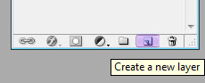
4. We’re going to want the flames on their own layer, so we can manipulate them. So, in your layers palette, click on “Create a New Layer” (if your layers palette isn’t open, select Window > Layers from the top menu).
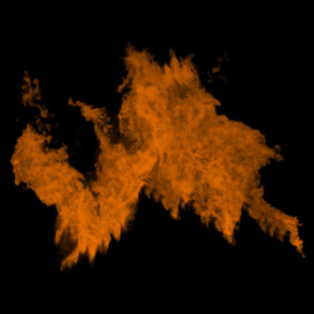
Choose a nice bright orange as your foreground color (I’m using #ff7500). Resize your brush to about 450 so that it fits onto the canvas, and click once in the middle.
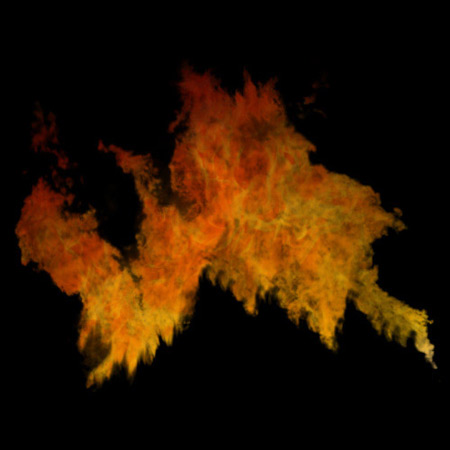
Mine looks like this:
5. You’re going to want to apply a pattern to those flames, since flames are not generally a uniform orange in color. They have flecks of yellows and reds and even whites in them. To do that, first you’ll need to make sure that your flames patterns are extracted into the right directory. Using your favorite extraction program (WinZip is what I used to use – but if you’re a Windows user, you won’t need one – it’s built into the Windows Operating System), unzip the SS-flames-patterns.zip file. For the destination, choose Program Files > Adobe > Photoshop (version ##) > Presets > Patterns.
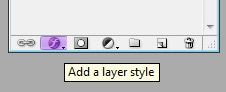
Now, back in Photoshop, click on the small “f” on the bottom of your layers palette. The “Add a Layer Style” button. I have it highlighted in purple on the image to the right.
Choose “Pattern Overlay” from the menu. You’ll see a menu like the one below pop up. Click on the small down arrow to the right of the currently selected pattern, and you’ll see all of the patterns in your currently selected pattern set. We want to load the fire patterns, so click on the small arrow that I have highlighted in purple.
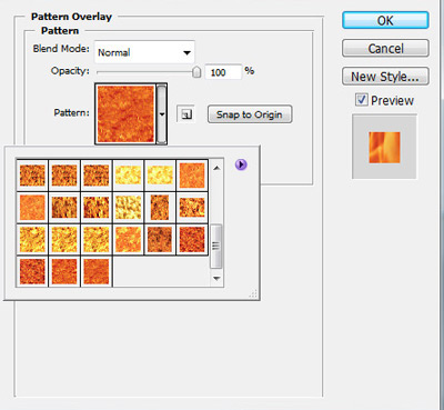
Since we placed the SS-fire-patterns.pat file into Photoshop Patterns directory, it should show up within the list that pops up. Look for “SS-fire-patterns” and click on it to load it. You should now see a bunch of patterns that look like flames in that window.
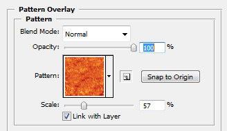
6. Choose one that you like. It doesn’t matter which, really. I’m using the “flames20” pattern. I changed the scale to 57%, and you may want to change the opacity a bit, too. It depends on the color you’ve chosen and how much you want the flames pattern to show up.
If you want the “placement” of your flames pattern to be a bit different, you can change that, too. While this Pattern Overlay window is open, left click on your canvas anywhere – and drag. You’ll see the pattern move along with your cursor. If you want to put it back to where it started at any time, click on that “Snap to Origin” button.
Here’s how mine looks now:

Starting to look a bit better, right? But still not quite there.
That’s because flames are lighter in color and brighter the closer that you get to the flames’ source. A candle flame burns hottest right around the wick, then dissipates as it rises. So, the colors near the base are yellows and whites, while the colors near the tops are dark oranges and reds. Luckily, Photoshop has a tool that works perfectly for helping us create such a thing — gradients!
7. Before you take this next step, make sure that your pattern is how you like it, because you’re going to be unable to change it. In your layers palette, click on the background layer to select it. Then click on the “Create a New Layer” button once again. This will make a new layer between the background layer and the one with your flames on it.
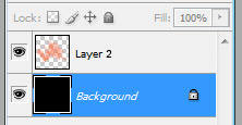
Your layers palette should now have 3 layers. Click on the very top layer (the one with your flames). Now click Layer > Merge Layers (I think older versions of PS may say “Merge Down” instead of “Merge Layers”) from the main menu. Or, click CTRL-E (Mac: CMD-E). That will merge your flames layer onto the empty layer beneath it, and you should be back down to 2 layers again like the image on the right.
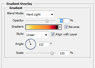
8. Click on the top layer to select it. Choose the small “f” looking button on the bottom of the layers palette, just like we did earlier when we were going to apply a pattern (the Layer Styles button). However, this time choose “Gradient Overlay” from the menu.
The Layer Styles window will pop up. It will likely have a black and white gradient selected when you begin, unless you have some kind of special gradient set loaded. It doesn’t matter what’s there, though, because we’re going to make our own.
Click on the actual gradient area, where you can see the one color transitioning into another. Just to the right of the word “Gradient:” – the area with the colors. Clicking on that will bring up a new popup menu that looks like the one below. If you know how to add colors to gradients already, skip step 9 and just go ahead and add colors to the gradient to make it look like I have here. (Black is the left color, btw, to help the flames fade into the black background – if you don’t have a solid black background behind it, choose a dark red or orange color.)
If you haven’t done much with gradients before, don’t worry. I’ll walk you through it.
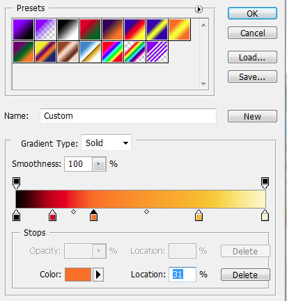
9. That bar with the colors on it is what your gradient is going to be. A gradient is basically one color merging slowly into another one. As you can see, I have quite a few colors in the gradient to help the flame color transition properly.
Click on the small black box just beneath the far left side of the gradient area. The current color will be selected just to the right of the place where it says “Color:” on the very bottom of that window. Now, click on that color – right there in the middle of that box.
A color picker will come up. Choose black or a dark red. (We’re using a color this dark to help it blend into the black background as the flame reaches the top. If you don’t have a solid background in the photo that you’re trying to use flames on, choose a dark red or dark orange for this color instead.) Click OK.
Do the same on the box just beneath the right side of the gradient. Select a light yellow color.
Now we need to add more colors to the gradient. To do that, just click beneath the gradient bar anywhere along it. You should have created another box. Click on that box and then change the color just like you did before. Keep doing that until you have 5 boxes with various colors in them, just like I have in the image above. You can then click on the little boxes and drag them into the proper position until they are spaced like I have them in the image.
The colors that I’ve used in my gradient are: #310101, #7d1a00, #ff9600, #ffc000, and #fffcc8.
10. Once you have them how you want them, click “OK” to bring you back to the Layer Styles window.
Click on “Reverse” just to the right of the gradient bar, since we want the darks at the top and the lights at the bottom.
There’s all kinds of things that you can play around with now to make your flames look just right. As you can see in my image below, I’ve changed the blending style of the layer to “Hard Light,” the Opacity to 70%, the angle of the gradient to 112, and the scale to 133%. All of these are up to you. Play around with the settings, see which blending style you like best, how dark you want the gradient to show up, etc. These are going to vary depending on your image, the background, which brush you used, which pattern you chose – any number of factors. So don’t be afraid to play around with it!
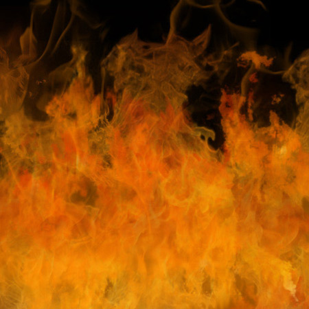
11. As a last step, I took a round, soft brush that was set at a very low opacity and erased around the top edges of the flames to help them fade off into the black background. Flames are fairly transparent, and they become moreso near the tops of the flame area. My flame now looks like this:
Still not as perfect as it could be, perhaps, but that goes a HUGE step toward helping create more realistic flames using my brushes and patterns. You just have to play around with it a bit to get it to look how you’d like. Every scene and every flame will be slightly different. I’ve gone ahead and made an image using a bunch of layers, each with a different flames brush from my set and some of the various patterns. As you can see, it looks pretty good! This was made using the techniques listed here.
That’s it! I hope that you’ve enjoyed this tutorial, and I hope that it answers some of your questions about how to best use my flames brushes and fire patterns. If you have any questions, don’t hesitate to ask!